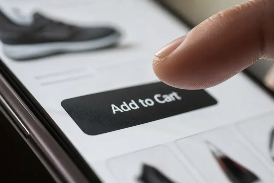

In e-commerce, a button can seem like a minor interface detail. For a shopper, however, it often represents the next decision in a journey that includes comparing products, choosing options, reviewing costs, and committing to a purchase. Looking at add to cart button patterns can be useful for inspiration, but the strongest design always starts with the shopper’s actual question: “What happens if I select this?”
Effective calls to action do more than attract attention. They remove uncertainty before asking for commitment. Whether a shopper is adding an item, choosing delivery, saving an address, or placing an order, the action should feel predictable, easy to select, and easy to recover from if something goes wrong.
Why Small Interface Actions Matter
Shoppers judge a store through dozens of small interactions. A product page may have excellent photography and useful descriptions, but confidence can disappear if the main action is hard to find, unclear, or unresponsive. Cart abandonment remains common across online retail, which is why teams should examine the complete buying journey rather than assume one new button will solve every problem. Recent cart abandonment research also reinforces that customers leave for many reasons, including unexpected costs, delivery concerns, trust issues, and complicated checkout flows.
The best call to action supports the decision already forming in the shopper’s mind. It should not pressure someone into guessing, searching, or wondering whether a click will create an immediate charge.
Start With the Shopper’s Next Question
Before selecting an action, most shoppers want answers to three basic questions:
- What will happen when I select this?
- Will my item, price, or order change immediately?
- Can I reverse this action if I need to?
Labels should answer those questions directly. “Continue” may work when the context is unmistakable, but it often makes people pause. “Review Cart,” “Choose Delivery,” “Save Address,” and “Place Order” communicate a specific next step and reduce interpretation.
Use Labels That Remove Guesswork
Action labels work best when they use direct verbs, remain short enough to scan, and stay consistent throughout the site. Clever wording may fit a brand voice, but it should never hide the button’s purpose.
- Instead of “Continue,” use “Review Cart” when the shopper is moving to the cart.
- Instead of “Submit,” use “Save Address” when storing information.
- Instead of “Buy,” use “Place Order” when the customer is completing a purchase.
- Instead of “Next,” use “Choose Delivery” when the following screen concerns shipping options.
Consistency matters just as much as clarity. If “Add To Cart” means one thing on a product page, do not replace it with “Get It” elsewhere unless the outcome is exactly the same.
Give the Primary Action a Clear Visual Role
Each important section should have one obvious primary action. This does not require oversized buttons or aggressive colors. It requires a deliberate visual hierarchy that helps shoppers distinguish the main path from supporting choices.
- Use contrast that makes the primary button easy to locate.
- Separate secondary actions with spacing, lighter styling, or reduced emphasis.
- Keep the main action close to the price, selected options, and stock status.
- Avoid presenting several equal-looking buttons side by side.
- Do not bury the action below lengthy descriptions or reviews.
Strong contrast should still fit the broader interface. The goal is confidence and visibility, not visual noise.
Design for Mobile First
Mobile shoppers have less screen space, less precision, and often less time. Someone comparing products while commuting may be using one hand, dealing with glare, or switching between apps. A button that feels obvious on a wide desktop display may become difficult to notice or tap on a phone.
Give actions adequate touch space, allow long labels to wrap as needed, and ensure sticky controls do not cover prices, product options, validation messages, or checkout totals. The minimum target size guidance from W3C is a practical reminder that buttons need enough size or spacing to reduce accidental selections.
Make Accessibility Part of the Core Design
Accessible actions help shoppers with permanent disabilities, temporary injuries, limited dexterity, older devices, poor lighting, and low digital confidence. Accessibility should be considered during the first design round, not treated as a final compliance check.
- Use real button elements for actions rather than clickable text containers.
- Keep keyboard focus visible at every step.
- Provide descriptive names for screen readers.
- Do not use color as the only way to communicate success, loading, or errors.
- Include visible status messages such as “Added To Cart” or “Payment Processing.”
Show Immediate Feedback After Every Action
A silent button creates doubt. Shoppers may tap again, assume the page failed, or leave before the action is complete. When a customer selects “Add To Cart,” the interface should immediately indicate that work is in progress and then confirm the result.
Useful feedback can include a temporary loading state, an updated cart count, a brief confirmation message, or a side panel that shows the added item. When something fails, explain the problem in plain language and offer a clear recovery action such as “Try Again,” “Choose Another Payment Method,” or “Update Delivery Address.”
Reduce Doubt Before the Final Click
A polished button cannot compensate for hidden information. Shoppers hesitate when delivery timing, return terms, final costs, or item availability remain unclear until late in the process. Display key details close to the point where they influence a decision.
- Show stock status near the main purchase action.
- Share the expected delivery timing before checkout when possible.
- Make return information easy to find.
- Reveal taxes, shipping charges, and required fees early.
- Clarify whether an action saves an item, starts checkout, or creates an order.
Choose the Right Pattern for the Moment
Match the action to the shopper’s task
- Inline actions work when shoppers should remain on the same page.
- Sticky actions can help on long mobile product pages if they do not block content.
- Side-panel confirmations let shoppers confirm an addition while continuing to browse.
- Full cart transitions work well when shoppers need to compare items or review totals.
- Multi-step actions are appropriate when a product requires size, color, subscription, or delivery choices to be selected first.
No pattern is universally best. Product complexity, order value, screen size, and the amount of information still needed should shape the choice.
Test More Than Click-Through Rate
A higher button selection rate is not automatically an improvement. Track whether shoppers complete the intended task without confusion. Useful measures include duplicate taps, time to confirmation, backtracking, checkout errors, completed orders by device type, keyboard task success, and customer comments about unclear steps.
Test one meaningful change at a time, such as a clearer label, better placement, stronger confirmation, or earlier delivery information. This makes it easier to understand what helped and what merely changed the page’s appearance.
A Simple Review Process for Product Teams
- List every important action in the shopping journey.
- Define what the shopper expects to happen after each one.
- Replace vague labels and remove duplicate actions.
- Review the layout on narrow mobile screens.
- Test keyboard navigation, focus states, and screen reader announcements.
- Confirm that pricing, delivery, stock, and returns are visible before commitment.
- Measure behavior before and after changes.
- Use support requests and customer feedback to identify hesitation.
Conclusion
Clear e-commerce calls to action make shopping feel dependable rather than demanding. They explain the next step, support different ways of interacting, provide visible feedback, and appear alongside the information shoppers need to decide. When labels, accessibility, product details, and checkout behavior work together, the interface becomes less of a hurdle and more of a helpful guide.
Also Read-Innovative Technologies in Metalworking Equipment







Leave a Comment