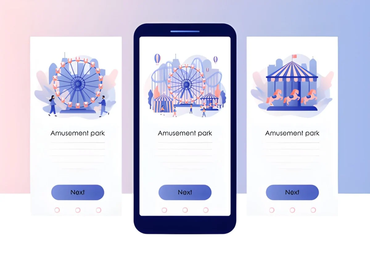

Web carousels, also known as sliders, are a popular way to showcase content, promotions, or multiple products in a limited space. When executed well, carousels help site visitors engage with more content efficiently and intuitively. For an in-depth look at carousel examples and design inspiration, see this carousel UI gallery for practical ideas on integrating them effectively.
Effective carousel design is crucial for enhancing user experience and website accessibility. Often, carousels are implemented without proper consideration for how visitors interact with them, leading to confusion and frustration. A well-designed carousel not only empowers users but also aligns with website objectives by employing thoughtful content and navigation. Carousels serve varied functions across different sites; for instance, they can showcase retail promotions or feature important articles on content-centric platforms. Understanding user intent is key to optimizing carousel effectiveness, ensuring that the feature promotes engagement and facilitates seamless interactions.
Prioritize User Control
User control is the foundation of an effective carousel. Autoplay features may seem engaging, but research repeatedly shows they can annoy users or prevent them from absorbing key information because slides may change before a user is finished reading. Always provide prominent controls, such as previous and next arrows, so users may navigate slides at their own pace. Allow pausing of the carousel, especially if movement could distract or impede those with cognitive disabilities.
Ensure Accessibility
Carousels should be usable by all visitors, regardless of ability. This involves more than visual design. Make sure every interactive element (arrows, indicators) is accessible via keyboard for users who do not use a mouse. Screen reader users need announcements of slide changes and descriptions for each carousel item. ARIA roles and live region alerts should be used for dynamic slide content. For details, see the W3C accessibility carousel tutorial.
- Activate carousel controls using the Tab and Enter keys.
- Ensure every slide has meaningful text or alternative text for images.
- Use focus indicators so users know where they are in the carousel structure.
- Progress dots should be labeled to assist users relying on screen readers.
Optimize Performance
Carousels can slow down website speed because they often feature high-quality imagery or multimedia. Visitors will leave a slow-loading site regardless of how engaging your content is. Use compressed images, lazy-load offscreen slides, and minimize code bloat. Make sure your carousel works well across different screen sizes. Responsiveness is crucial on mobile devices, where bandwidth and screen real estate are limited. Google’s guidance on carousel best practices provides strategies to enhance load speed and efficiency.
- Optimize images in modern formats like WebP or AVIF.
- Implement lazy loading for slides not immediately in view.
- Check performance using tools like Lighthouse and adjust scripts accordingly.
- Ensure all carousel elements resize and rearrange smoothly across mobile, tablet, and desktop.
Focus on Content Quality
Carousels are only as effective as the quality of their individual slides. Avoid cramming too much text or too many interactive elements into a single slide. Each slide should convey a single, focused message that prompts user action, whether that be learning more or exploring a highlighted product. Quality visuals paired with short, compelling copy tend to perform the best.
- Prioritize one action or takeaway per slide.
- Use crisp, relevant imagery and align copy to support your objective.
- Test different slide orders to see which combinations drive interaction.
Provide Clear Navigation
Navigation must be straightforward for all users. Provide both arrow controls and visible pagination indicators, such as dots or thumbnails, to inform users about their position in the carousel. Sure, visual feedback is critical, so users understand when a slide changes and can anticipate what’s next. Navigation controls should be large enough to interact with on touch devices, reducing frustration and improving usability. For additional user experience tips, the Nielsen Norman Group’s research on carousels offers actionable insights.
Test and Iterate
Usability problems often go undetected until you test carousels in real-world scenarios. Conduct regular usability tests on multiple devices and screen readers. Gather feedback from actual users, monitor analytics for carousel interaction rates, and conduct A/B testing to compare different versions. Iterate based on findings, and continuous optimization ensures your carousel provides long-term value for all audiences.
Conclusion
Web carousels can be a powerful tool for engagement and conversion on any website when thoughtfully designed. By prioritizing user control, ensuring accessibility, optimizing performance, focusing on content quality, providing clear navigation, and conducting ongoing testing, you ensure a positive and inclusive experience. These best practices enable your carousel to elevate both the utility of the content and the overall user experience on your site.
Read more: How Internal Linking Shapes SEO Success
What to Expect During Alcohol Rehab Treatment
How Childhood Trauma Shapes Adult Mental Health

Leave a Comment