
Key Takeaways
- Choose paint colors based on each room’s purpose, desired atmosphere, and daily activities.
- Test colors under different lighting conditions throughout the day.
- Compare paint undertones with existing floors, cabinets, countertops, and furnishings.
- Create a consistent whole-home palette using complementary base, supporting, and accent colors.
- Select appropriate paint finishes based on room conditions, durability, and cleaning needs.
- Test larger paint samples before committing to a final color.
- Use 2026 color trends as inspiration while prioritizing personal preferences and the home’s existing style.
- Prepare surfaces properly to achieve a clean, lasting paint finish.
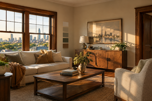
Choosing interior paint colors for a Kansas City, MO, home is about more than finding a shade that looks appealing on a tiny card. The right color needs to work with the room’s purpose, the daylight coming through its windows, permanent finishes, and the way your household lives in the space. Professional Interior Painting Kansas City, MO, services can help turn a color plan into a clean, durable result. Still, the best plans begin with a clear understanding of the home itself. Kansas City homes range from historic properties with warm woodwork to newer open-concept spaces with cooler stone, tile, and cabinetry. Rather than chasing one universal “right” color, build a palette that feels comfortable through bright summer afternoons, gray winter days, and evenings spent under artificial lighting.
Start With The Room
Before collecting paint chips, decide what the room should do for you. A bedroom may need to feel calm and private, while a kitchen may need to feel bright, welcoming, and easy to keep looking fresh. Write down a few mood words, such as cozy, open, focused, warm, relaxed, or energetic. This simple step keeps color decisions tied to daily life instead of a passing impulse. Busy gathering spaces can support warmer neutrals or richer accents, while a home office may benefit from a quieter backdrop that does not compete with screens, shelving, or paperwork. Utility rooms often call for practical, forgiving colors and a finish that can handle regular cleaning.
Study The Natural Light
Light can change paint more dramatically than most homeowners expect. North-facing rooms often receive cooler, indirect daylight, while south-facing rooms generally receive stronger, warmer daylight. East-facing rooms are brightest earlier in the day, and west-facing rooms can become especially warm later in the afternoon. In a Kansas City home, that variation can make one color look gentle in a front room and much stronger in a rear room. Also consider lamps, recessed fixtures, and overhead lighting. A warm bulb can pull warmth from beige or white paint, while cooler lighting may emphasize gray, green, or blue notes. View samples in the morning, afternoon, and evening before making a final choice.
Check Paint Undertones
An undertone is the subtle color underneath the main color you notice first. A white may lean creamy, pink, gray, blue, or yellow. A beige may have gold, green, or peach beneath it. Even gray paint can read blue, violet, or warm taupe depending on the surrounding materials. Compare samples beside fixed features, including flooring, countertops, backsplashes, tile, brick, wood trim, and upholstery. A gray that looks balanced against a blank wall may appear noticeably blue next to warm oak flooring. Checking those relationships first prevents a finished room from looking unintentionally mismatched.
Choose Colors By Room
Living Rooms
Living rooms often work well with flexible colors that support furniture, artwork, and conversation. Warm off-whites, softened greens, muted blues, and earthy neutrals can provide a versatile backdrop. If the room has strong natural light, a deeper accent wall or built-in color can add definition without overpowering the entire space.
Bedrooms
Bedrooms are personal spaces, so comfort matters more than a rule about what color they “should” be. Soft blue-greens, gentle neutrals, dusty rose, and subdued earth tones can create a restful effect. In a large bedroom, a deeper color may make the room feel more grounded and intimate rather than empty.
Kitchens And Dining Areas
Start with cabinets, counters, backsplashes, and metal finishes. Paint should connect those elements rather than compete with them. Kitchens also need a color that remains appealing under bright task lighting. Dining areas can take more warmth or depth when the goal is to create a defined gathering space.
Bathrooms
Bathrooms may have limited daylight, reflective mirrors, and tile with a pronounced undertone. Test paint on the wall beside the tile and vanity, then choose a washable finish that suits a moisture-prone, frequently used room. A compact powder room can also be a good place for a more dramatic color because it is visually separate from the main living areas.
Hallways, Stairways, And Entry Areas
These connecting spaces influence how the whole home feels. Lighter or mid-tone colors can help narrow hallways feel less enclosed, while a repeated trim color creates continuity from room to room. An entry can introduce an accent color, provided it relates to the colors visible beyond it.
Build A Whole-Home Color Flow
Not every room needs the same wall color. A connected home needs intentional relationships between the colors. One easy approach is to use a three-part palette:
- Base color: A flexible neutral or soft color for major living areas.
- Supporting color: A related shade for adjacent rooms, built-ins, or a bedroom.
- Accent color: A richer hue for a powder room, niche, door, ceiling, or limited wall area.
Repeat one or two elements, such as a trim color, warm undertone, or accent family, to make transitions feel deliberate. Avoid placing several unrelated bold colors within the same line of sight.
Select The Right Paint Finish
- Flat or matte: Low sheen that softens the look of wall texture, often used in lower-traffic areas and on ceilings.
- Eggshell: A subtle sheen that offers more cleanability than flat paint and works well in many living areas.
- Satin: A smoother, more noticeable sheen suited to active rooms, bathrooms, and trim in some homes.
- Semi-gloss: A durable, reflective finish commonly used for doors, trim, and cabinetry.
Higher sheens reflect more light and can make surface flaws more visible. The best finish depends on the condition of the surface and the room’s daily wear.
Test Colors Before Painting
- Use large samples on multiple walls.
- Place samples near trim, windows, flooring, and major furniture.
- Check them under daylight and the lighting used at night.
- Leave them up for at least a full day.
- Compare several close choices before committing.
Personal response belongs in the process. Ideas about how colors in a home can affect mood are useful prompts, but they are not rigid rules. If a color feels welcoming and complements the room’s lighting and finishes, it may be the right choice for your household.
Avoid Common Color Mistakes
- Choosing from a small swatch without testing the color on the wall.
- Ignoring existing floors, cabinets, countertops, and tile.
- Selecting a cool white beside strongly warm finishes.
- Using a trend without considering the room’s purpose.
- Forgetting ceilings, doors, trim, and built-ins.
- Skipping surface preparation before the final coat is applied.
What Is Shaping Interior Color Choices?
Many 2026 color conversations are centered on warmer neutrals, nature-inspired greens, earthy browns, softened yellows, and saturated accent shades. The 2026 colors of the year reflect that broad movement toward warmer, more personal interiors. Use trends as inspiration rather than instructions. A warm khaki, olive green, clay tone, or creamy neutral can feel current, but it should still suit the Kansas City home’s lighting, architecture, furnishings, and the people who use the room every day.
Final Room-By-Room Checklist
- What is the room’s main purpose?
- How much natural light does it receive?
- Are existing finishes warm, cool, or mixed?
- Which colors appear in furniture and artwork?
- What feeling should the room create?
- Will the finish handle daily use?
- Has the color been tested at different times of day?
- Does it work with nearby rooms?
A successful interior color plan feels connected, practical, and personal. When room function, lighting, undertones, finishes, and whole-home flow guide the decision, the finished paint color can look right in every season and for years to come.
Read more: https://grammerway.com/how-to-attach-a-shipping-label-without-covering-important-details/
https://grammerway.com/maximizing-returns-through-strategic-commercial-property-investment/

Leave a Comment